Yin yang tattoo: meaning, styles and design choices
A yin yang tattoo can serve as a reminder of a relationship between complementary aspects or an intention of balance. Its design is highly recognizable, but it is often mistakenly simplified into an opposition between good and evil.
Before choosing a design, understand its structure and compare the styles you like. This guide focuses on preparing the drawing: the circle, the curved separation, the contrasting dots, the botanical frame, and the placement of personal details.
A sense of relationship, not two enemy categories

Yin and yang belong to the history of Chinese thought. They are viewed in terms of interaction and complementarity. Isolating them into two completely separate categories or turning one into a superior value diminishes the concept.
The meaning of a yin yang tattoo can draw inspiration from this relationship, while remaining a contemporary personal intention. The motif does not require eliminating one aspect in favor of the other. It does not automatically designate two opposing people who should be correcting each other.
For more in-depth references, consult our article on the meaning of the yin yang. This guide focuses primarily on the graphic choices for a tattoo project, rather than the complete history of the concept.
You can appreciate the shape without seeking to summarize your entire philosophy in a drawing. A precise intention, such as keeping a place for multiple aspects of a situation, may be enough to give the motif meaning.
Elements of the design: circle, curve, and dots
The most well-known sign appears within a circle divided by an S-shaped curve. The two parts are distinguished by their contrast, and each contains a dot in the color of the other. These elements make it possible to recognize the motif without adding an inscription.
The yin yang drawing requires particular attention to proportions. The curve must remain legible, the dots must be distinct, and the outline must maintain its coherence. If you change an element, look at how it affects the reading of the whole.
To prepare your project, you can start with a simple sign before adding a frame or texture. This gives you a clear base. A heavily decorated composition does not necessarily compensate for an irregular circle or dots that have become difficult to see.
If a model shows only one half, it does not display the full sign. This variation may have a personal intention, particularly in a shared project, but it must be distinguished from the full representation.
A minimalist style: keeping the structure identifiable
A minimalist yin yang tattoo favors the main shape with few details. The contrast can remain stark or be interpreted through adapted linework. The choice must preserve what allows you to recognize the sign at first glance.
Look at the motif at the intended size. Are the dots still visible? Does the curved separation remain distinct? Does the outline blend in with other lines? These questions are more concrete than the idea of systematically choosing the smallest possible design.
Ask the professional how to maintain a clear reading. A design intended for a poster or a digital image may require a new version. Simplicity is not an automatic reduction of all elements.
A sober version may also better suit your way of understanding the motif. It leaves the relationship between the two parts at the center of the project, without adding references you do not wish to carry.
A botanical frame: distinguishing the sign from its surroundings

Branches or flowers can surround the sign in a contemporary composition. They give a mood and direction to the drawing but are not automatically part of its historical definition. The botanical frame and the yin yang remain two separate graphic elements.
A floral yin yang tattoo may appeal to you if you want a softer or more open shape. Look at the placement of the frame: leaves that are too close to the dots may mask them, while a very dense wreath might draw more attention than the circle itself.
Also choose the botanical element you actually wish to represent. A figurative flower, a stylized branch, and a simple ornament are not read in the same way. You can maintain an aesthetic intention without inventing a fixed meaning for every leaf.
The composition benefits from leaving space around the sign. The eye can then distinguish the central motif from its environment. A personalized project does not need to add numerous symbols to become personal.
Textures and colors: do not lose the contrast
A style with textures can transform the appearance of the two parts. Clear contrast remains useful for maintaining the silhouette. If the areas become very similar in color or density, the sign may require more attention to be recognized.
A yin yang motif can be graphically adapted, but each adaptation must be examined as a whole. Two landscapes, waves, or several small details do not automatically replace the structure of the sign. Decide what should be seen first.
Color can express your taste or a personal reference. It should not be presented as a universal code that gives the drawing a special power. If you wish to reproduce a specific artwork, also check its context rather than copying an isolated image.
To explain your preference to the professional, describe the desired result: strong contrast, subtle silhouette, botanical drawing, or structured composition. These indications are more useful than a long list of abstract qualities.
Compare styles before choosing
| Version | Visual Priority | Point to check |
|---|---|---|
| Sober sign | Circle, curve, and contrast | Dots and separation remain identifiable |
| Botanical frame | Relationship between sign and surroundings | Branches do not hide the central motif |
| Textured version | Mood and details | Contrast preserves the silhouette |
| Project split into two parts | Personal link between two drawings | Each half is distinguished from the full sign |
This comparison helps in selecting a direction rather than seeking a universally superior style. You can prepare two or three versions and note what you like about each. Keep the elements consistent with your intention and remove those that complicate the reading.
A couple or friendship project: leaving space for everyone
A yin yang couple tattoo can be chosen to evoke a relationship. It does not mean that each person must be incomplete alone or occupy a role permanently opposed to the other. A shared project must respect the preferences of each person.
You can choose two full signs rather than two halves. You can also prefer different drawings that recall a shared history. Graphic identity is not the only way to express a bond.
A relationship can evolve, and a permanent project deserves to mature individually. A shared accessory can also be your final choice. Giving meaning to a bond does not force you to represent it in an identical or permanent way.
Size and placement: personal decisions to discuss
A small yin yang tattoo must remain recognizable in the planned project. Look at trials at several sizes and from a normal distance. A very enlarged image on a screen may make the details look more attractive without showing how the drawing reads in reality.
The placement does not have a mandatory meaning. You may prefer discreet visibility or a more apparent expression. This choice does not make the symbol more effective; it corresponds to your way of living with the motif.
Discuss the execution, adaptations, and instructions with a qualified professional. A guide on design and symbolism does not replace this exchange. Above all, prepare your intention, the essential elements, and those you wish to avoid.
Explore the motif with a Yin Yang Flower of Life necklace
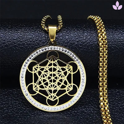
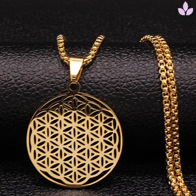
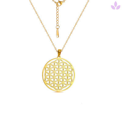
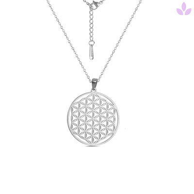
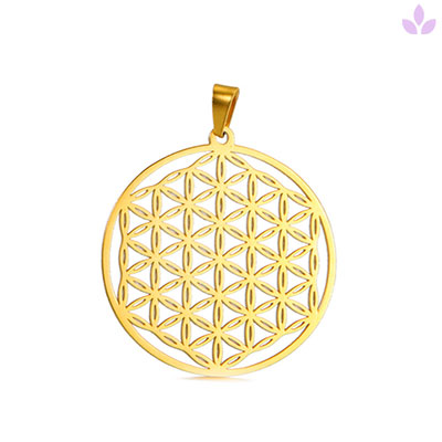
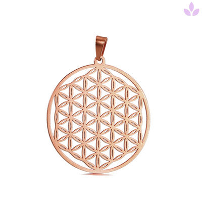
A piece of jewelry can help you appreciate a silhouette before committing to a permanent project. The Yin Yang Flower of Life Necklace combines a construction evoking the yin yang with an interlocking circle pattern.

This yin yang necklace offers an openwork interpretation, different from the black and white sign presented above. It is not a tattoo model ready to be copied. Compare its actual design, dimensions, and the materials indicated on the product page before choosing.
For other geometric patterns, discover our collection of Flower of Life necklaces. The flower of life and the yin yang are distinct drawings; associating them in a contemporary product does not give them a common origin.
A symbolic piece of jewelry can remain your favorite way to wear an intention. You are not obliged to get a tattoo. The object is chosen for its design and your pleasure in wearing it, with no guaranteed effect on balance or relationships.
Your checklist of questions before finalizing the project
First, ask yourself if you like the sign when it is separated from its explanation. Then, verify the elements that seem essential to you: full circle, contrasting dots, frame, or personal detail. Finally, look at whether you still appreciate the composition at the intended size.
A yin yang tattoo project becomes clearer when you can describe your intention in one sentence. "Keeping a place for multiple aspects" leaves room for a personal reading. You do not need to choose a design that claims to resolve all the tensions in your life.
FAQ – Frequently asked questions about the yin yang tattoo
Does yin yang mean good versus evil?
This moral reduction is misleading. The concept concerns, among other things, a relationship between complementary aspects.
Must the two dots remain visible?
They are part of the most well-known sign. If you adapt the drawing, discuss its legibility and what makes it recognizable.
Can one add flowers?
Yes, in a contemporary composition. The floral frame remains a distinct addition to the sign and should not mask its structure.
Should the motif be split in two for a couple?
No. Two full signs or two different motifs can also evoke a relationship. Each person should be free to choose.
Can one prefer jewelry to a tattoo?
Yes. A personal intention does not need a permanent medium to have value.
A legible sign, an intention you choose
A yin yang tattoo is prepared by understanding the motif and then working on its form. Keep a structure that is identifiable, compare styles, and take the time to choose with a professional. Your intention can remain simple, without reducing the symbol to an opposition between two camps.